‘Stranger Things’ – Typography
The Typography of ‘Stranger Things’ By Sarah Gless
How one designer got hooked to a TV show in 52 seconds
Like most of us at Nelson Cash, you’ve probably heard about Netflix’s latest cult show Stranger Things from your best friend or work buddy. And if you’re like me, you innocently pushed play on a work night and by midnight realized the scene in your living room was looking a lot like that one Portlandia skit.
Yes, the show is really that good. But what got me? Besides brilliant character development, a killer score, and all those warm and fuzzy nods to my youth?
These 52 seconds:
[embedyt] https://www.youtube.com/watch?v=VPDZkbq0Zp8[/embedyt]
As a person who spends her days trying to effectively communicate with people through design, I recognized another star on the screen: that typography, tho. 🙌
The Stranger Things title sequence is pure, unadulterated typographic porn.With television shows opting for more elaborate title sequences (think GOTand True Detective), the opening of Stranger Things is refreshingly simple. It trims the fat and shows only what is necessary to set the mood. More importantly, it proves a lesson I’ve learned time and time again as a designer: you can do a lot with type.
But how do a few pans of a logo accomplish so much in such a short amount of time? I break down its typographic success to three powerful plays: recognition, scale and palette.
1. Recognition
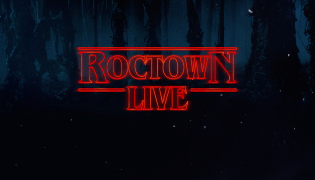
The Stranger Things logo probably looks strangely familiar, taking you back to an era when Stephen King reigned supreme. The show’s creators, Matt and Ross Duffer, directly cite King as the inspiration behind the show’s logo, having sent copies of King’s novels to Imaginary Forces, the creative studio behind the title sequence.

Immediately recognizable to anyone that lived through the 80s, those covers bring chills to your spine. Using a modified version of the distinctive typefaceBenguiat, the Stranger Things logo respectfully and effectively plays on that recognition in the title sequence, setting the mood for what is to follow.
2. Scale
Glowing red lines enter the frame. One might think they’re simple shapes at first, but soon you realize it’s a close up of the joint of N, the arc of R, the spine of S. They’re so close you can make out individual specks of film grain. Gets your heart going a bit, amiright?

An extreme close up is a cinematic technique that when used sparingly and with intent can invoke intense emotion from the viewer. By getting up close and personal, the viewer reaches a new level of intimacy with the scene. This intimacy causes the viewer to become vulnerable, and vulnerability elicits a deeper emotion—in this case, unease or even fear.
3. Palette
Finding the right combination of typefaces can be tiresome. Although there are no rules, there are some techniques designers use to guide us through the process. Using some of these techniques, the pairing of decorative serifBenguiat and geometric sans serif Avant Garde builds a typographic palette that effectively sets the tone for the show.

What particularly interests me about the two typefaces is their historical alliance. Each was designed by typographic heroes and old pals, Ed Benguiat (Benguiat) and Herb Lubalin (Avant Garde). Each was released by ITC in the 1970s. And each was inspired by distinct art movements of the early twentieth century — Benguiat by Art Nouveau and Avant Garde by Bauhaus.
The 1980s revived retro typography from various art periods in a way that brought new meaning to their use. By using them again in 2016, as theStranger Things team did so brilliantly, we are reminded of the historical power of typography, the transcendental property of design, and the nostalgia that lives forever in our hearts.
Note: I have since binge-watched the rest of the season. Bravo to the geniuses involved in the production of the show, with a special callout to the insanely talented team at Imaginary Forces. Credit for images used throughout this article goes to designer and animator Eric Demeusy.


